

JOINTHEBAND
Inspired by the layout of Spotify and the way they presented music, I created an application letting users meet people to attend concerts with them based on their music preferences.
Your favorite artist is in town and you want to go see them live in concert. The problem is you are having a hard time finding friends or family members that have similar music interests as you. Furthermore, sharing live music experiences is much better than going solo.
Problem
Background Research
The first thing I focused on was the research strategy. This helped me get a better understanding of flows in current UX and UI. To do so, I started researching how people usually go about meeting people and gathering data.
Key points found:
323.3 million people use dating apps spending at least 10 hours a week on it
People would rather have shared experience rather than material goods
30% of people have attended one or more concerts in the previous year

Tools
Figma
Team
My Role
Timeline
1 UX designer
UX Design
UX Research
8 Weeks
My Design Process
1
2
3
4
5
Discovery & Research
Synthesizing Research & Design
Placement & Layout Design
Execution
Test
Interviews
During the ideation phase of the project, I conducted user interviews to build new personas and to inform the design. I conducted 4 interviews to get more insights on users and how they approach going to concerts and meeting new people. Some of these questions include:
How do you go about meeting new people?
Anything that deters you from going to concerts?
How do you determine who you will attend concerts with?
What objectives influenced your questions?
Competetive Feature Analysis
For the research phase, we gathered data and did a competitive audit. Some of the apps I looked at were: Bumble, tinder, Apple Music, Spotify, Song kick, and Ticketmaster. I analyzed them with the following heuristics:
Personalization
Minimalist Design
Discovery
User control & freedom
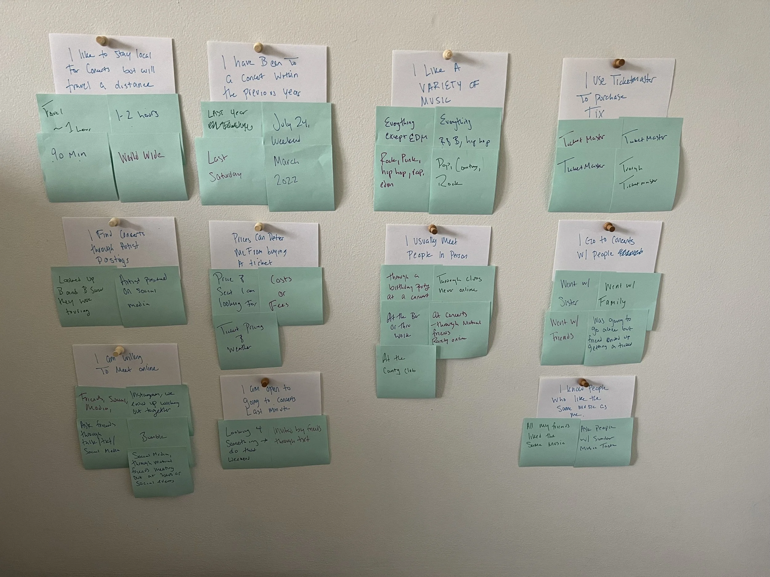
I also conducted a survey that got 20 responses. With that data, I was able to gather some important facts for the app.
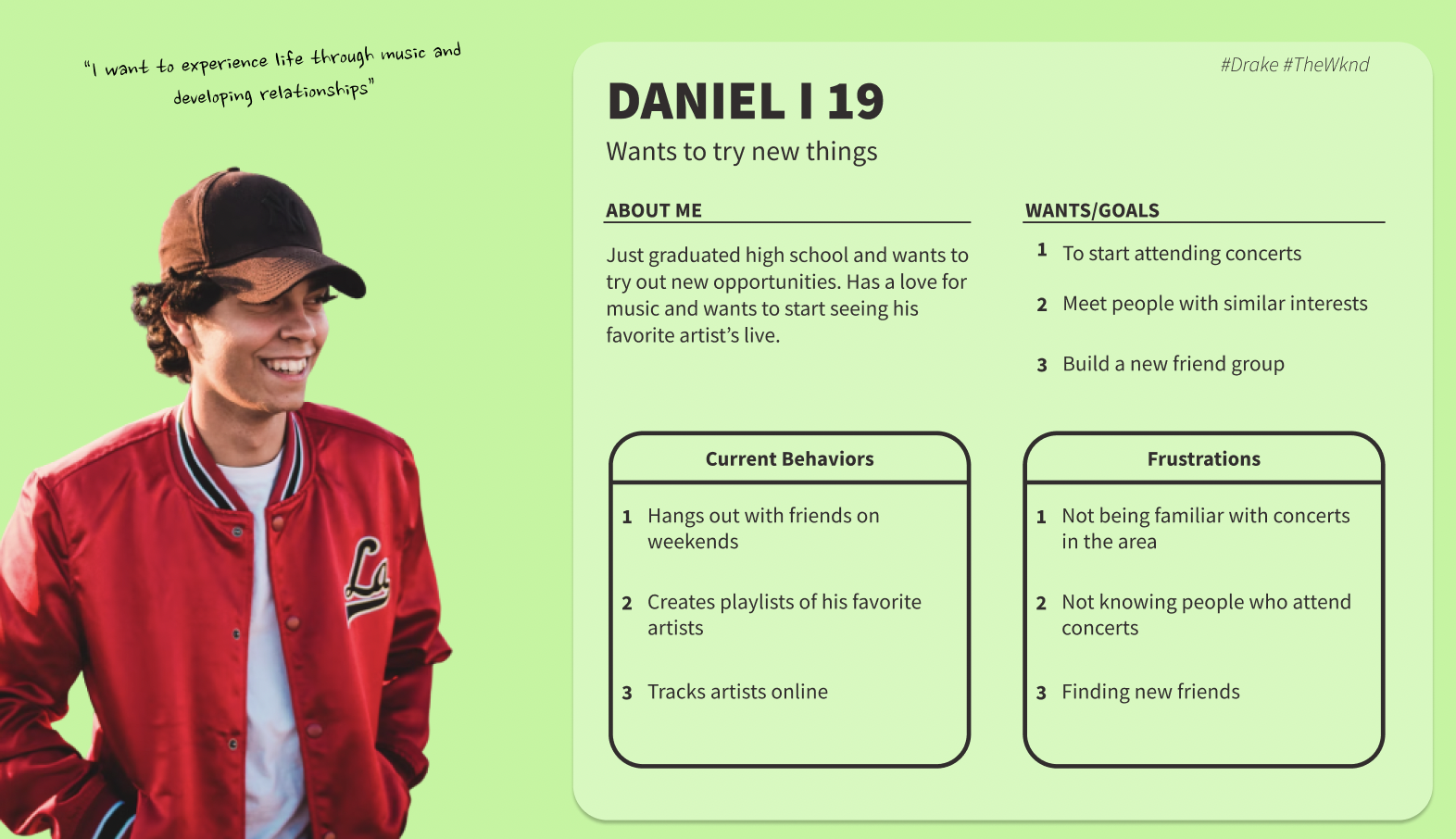
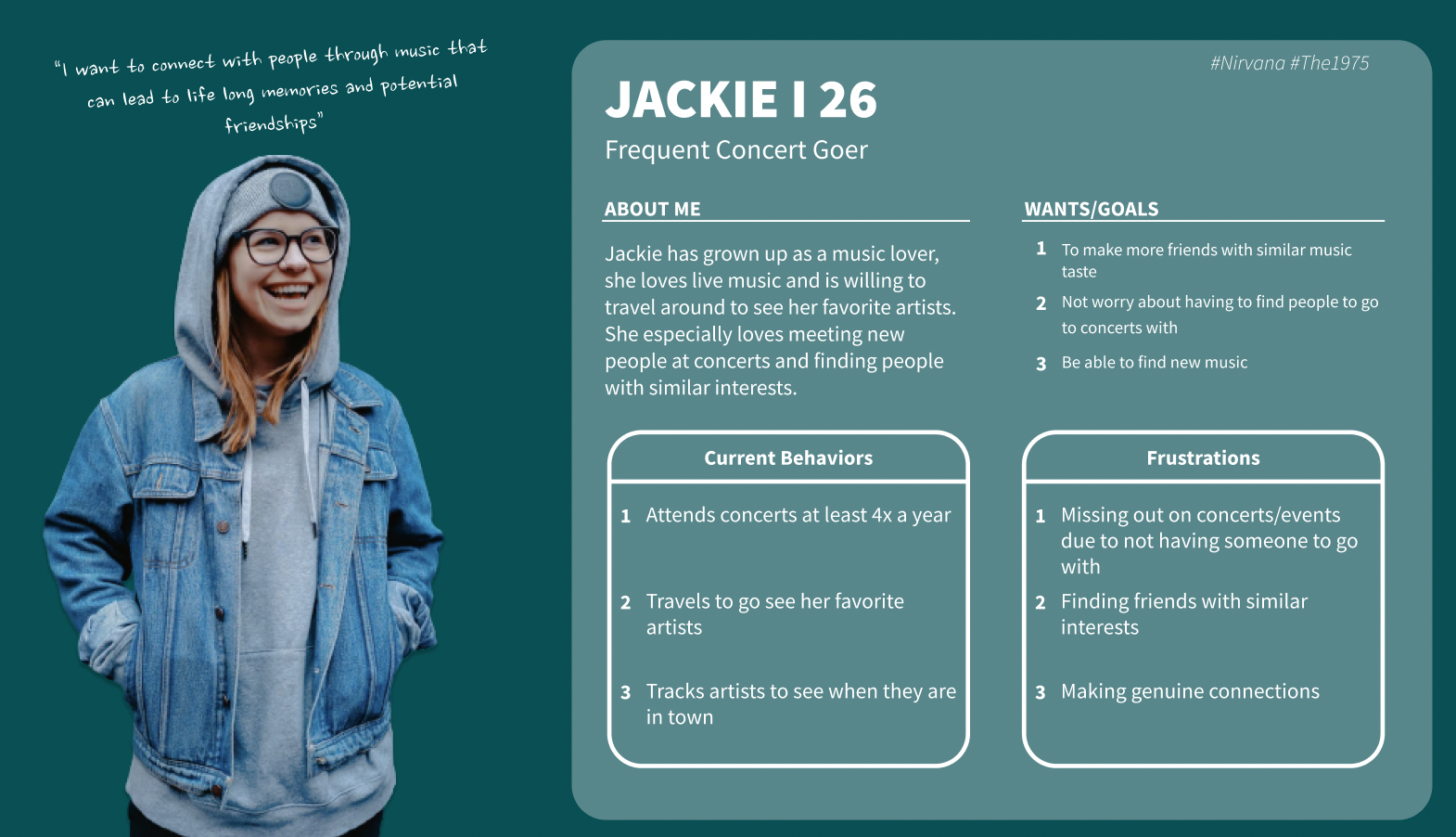
Personas
Synthesized Research
Main Takeaways:
Users want people to attend concerts with
Users prefer to go to concerts with others rather than alone
Users like to meet people in person
Users have been to a concert in the past year
Users like to stay local when it comes to attending concerts
Sketches
Onboarding Section
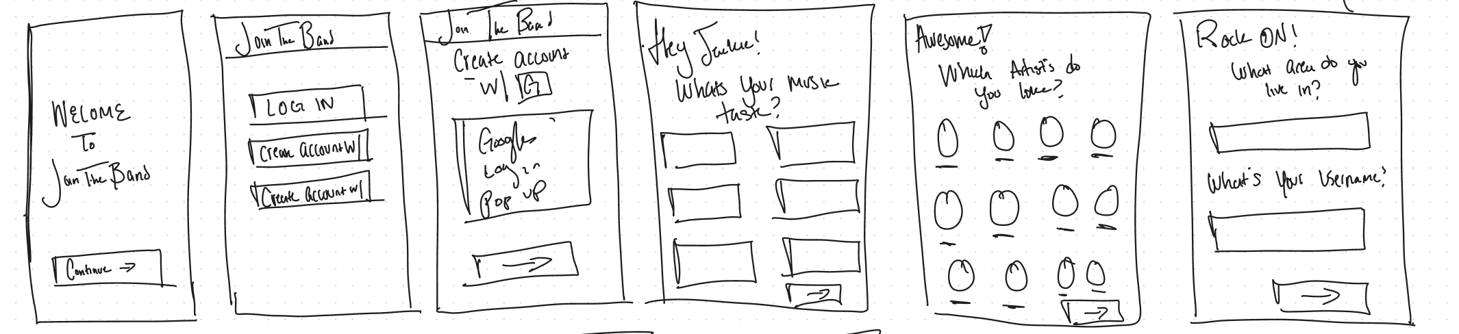
Here are the initial sketches for the onboarding process as I did want to keep it short and easy, I wanted to also bring in that personalization making the user feel excited about using the app. Using influences from Spotify and Songkick’s onboarding process the inspiration falls from there.
Lo-Fi Wireframing
After sketching out the wireframes, I moved into Figma and created low-fidelity wireframes.
Following the data I found, I chose a single ‘happy journey’ and mapped out the different designs.
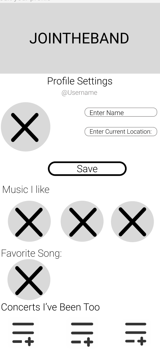

Design System
I developed a design system to add consistency, structure, and communication across the entire app. I chose a simple readable humanist typeface that would improve reading legibility at both small and large sizes. The color palette is based on Spotify’s color palette and has good contrast. I also implemented icons and friendly illustrations to bring some fun and enjoyment to the app.
Typography
Headline 1
Roboto (medium) 36px
Headline 2
Roboto (light) 24 px
Paragraph
Roboto (extra light) 16 px
Color Palette

#000000

#45B048

#FFFFFF

#D9D9D9
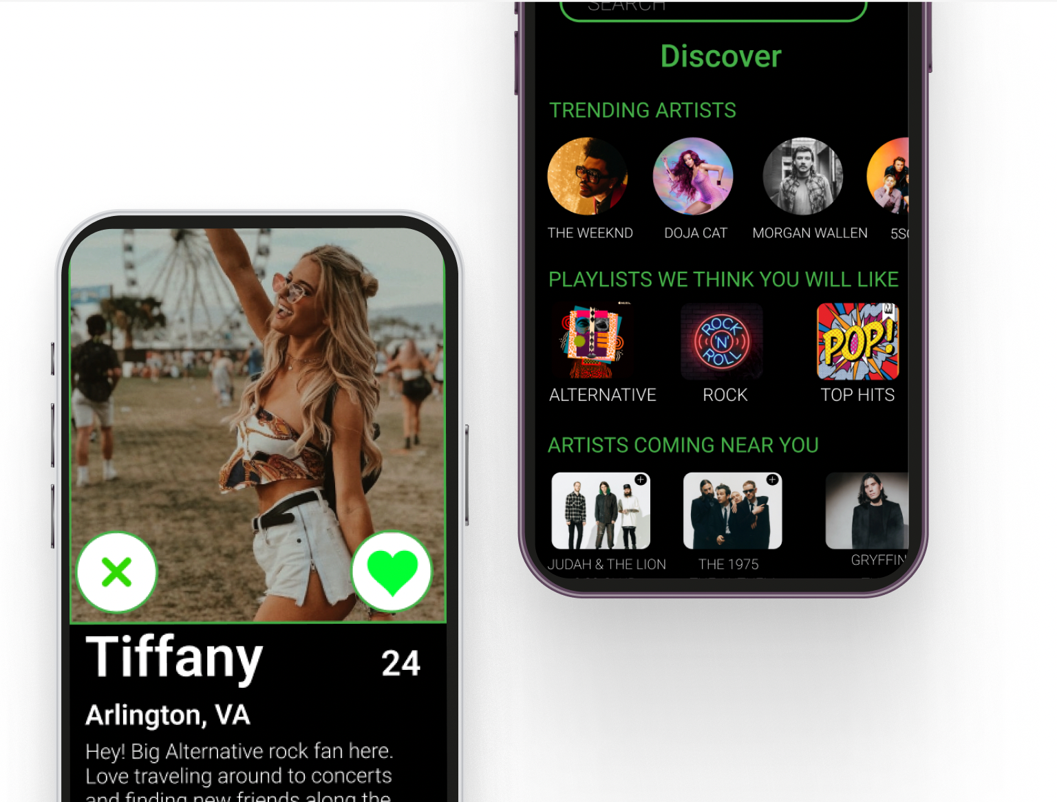
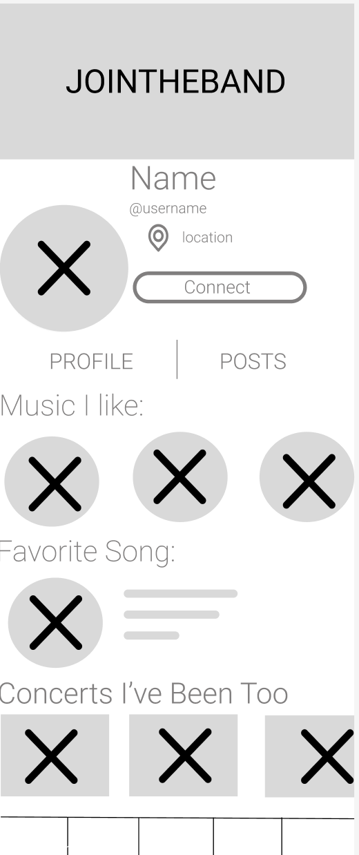
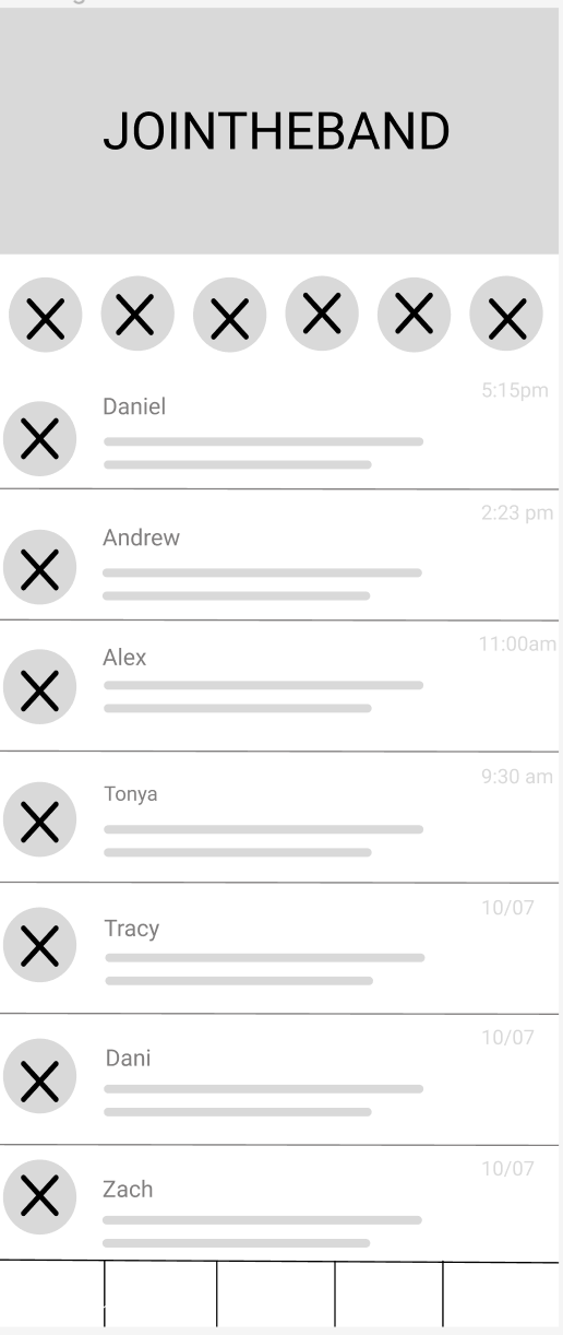
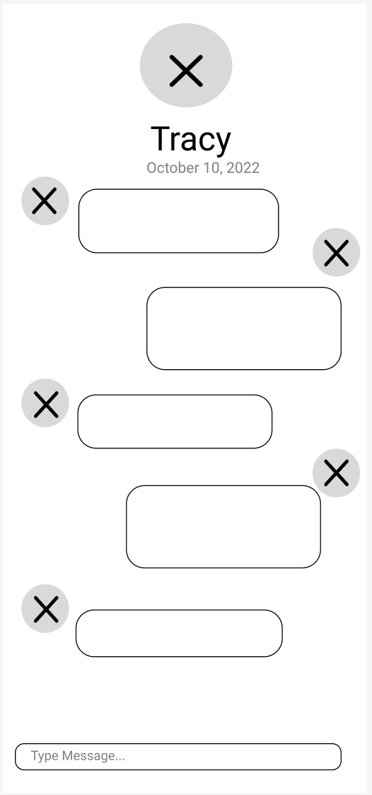
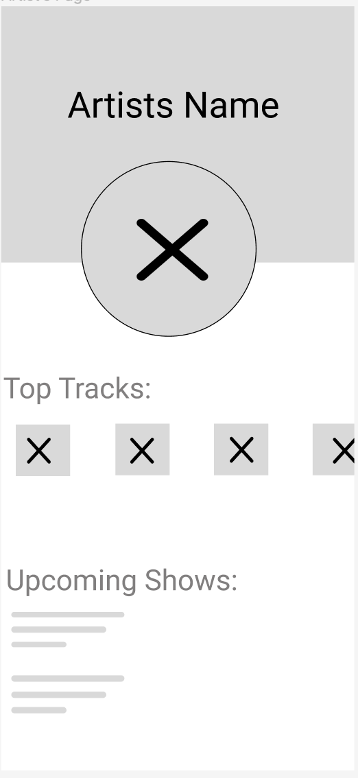
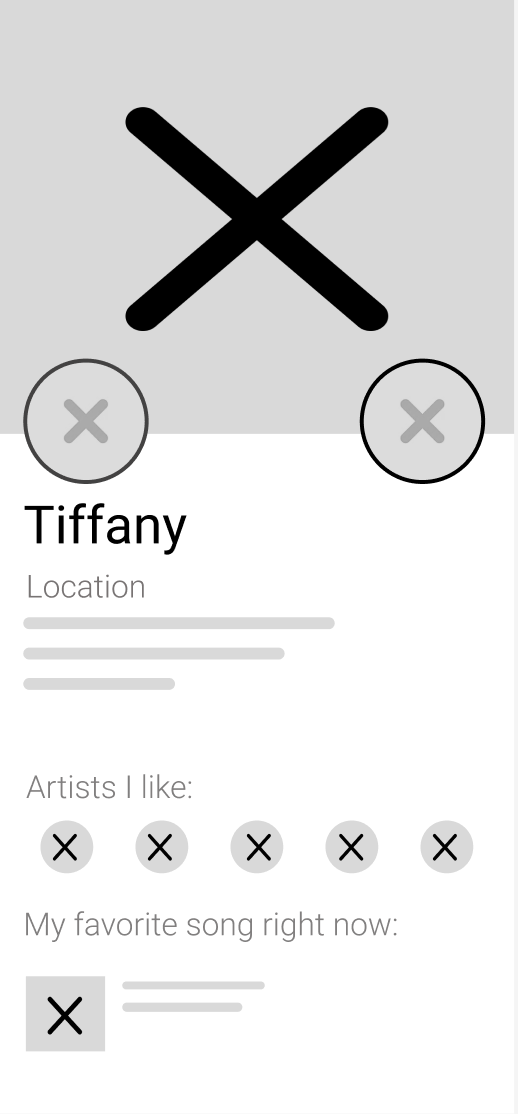
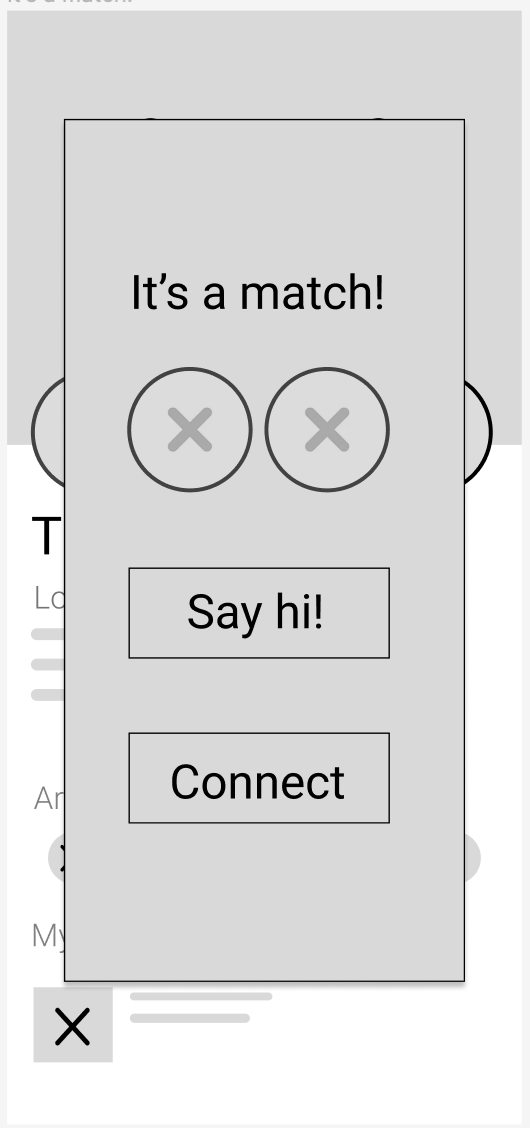
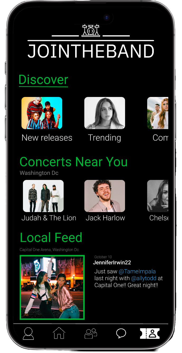
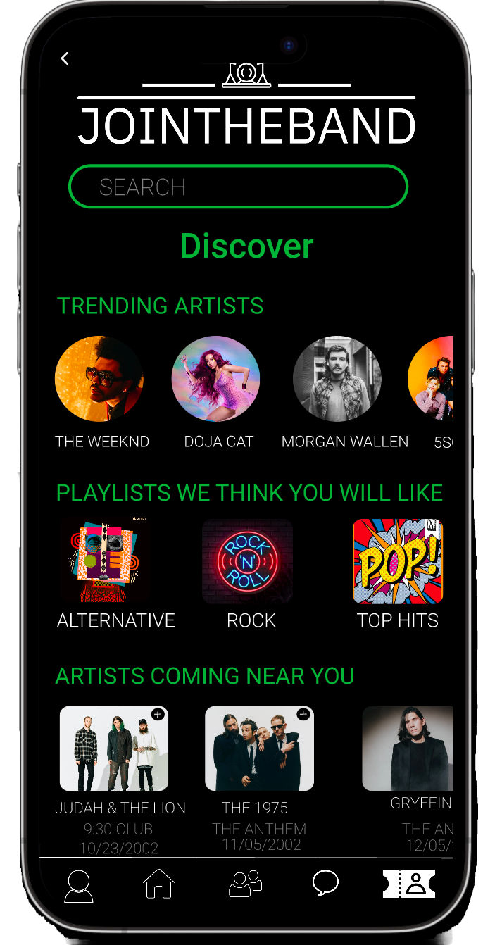
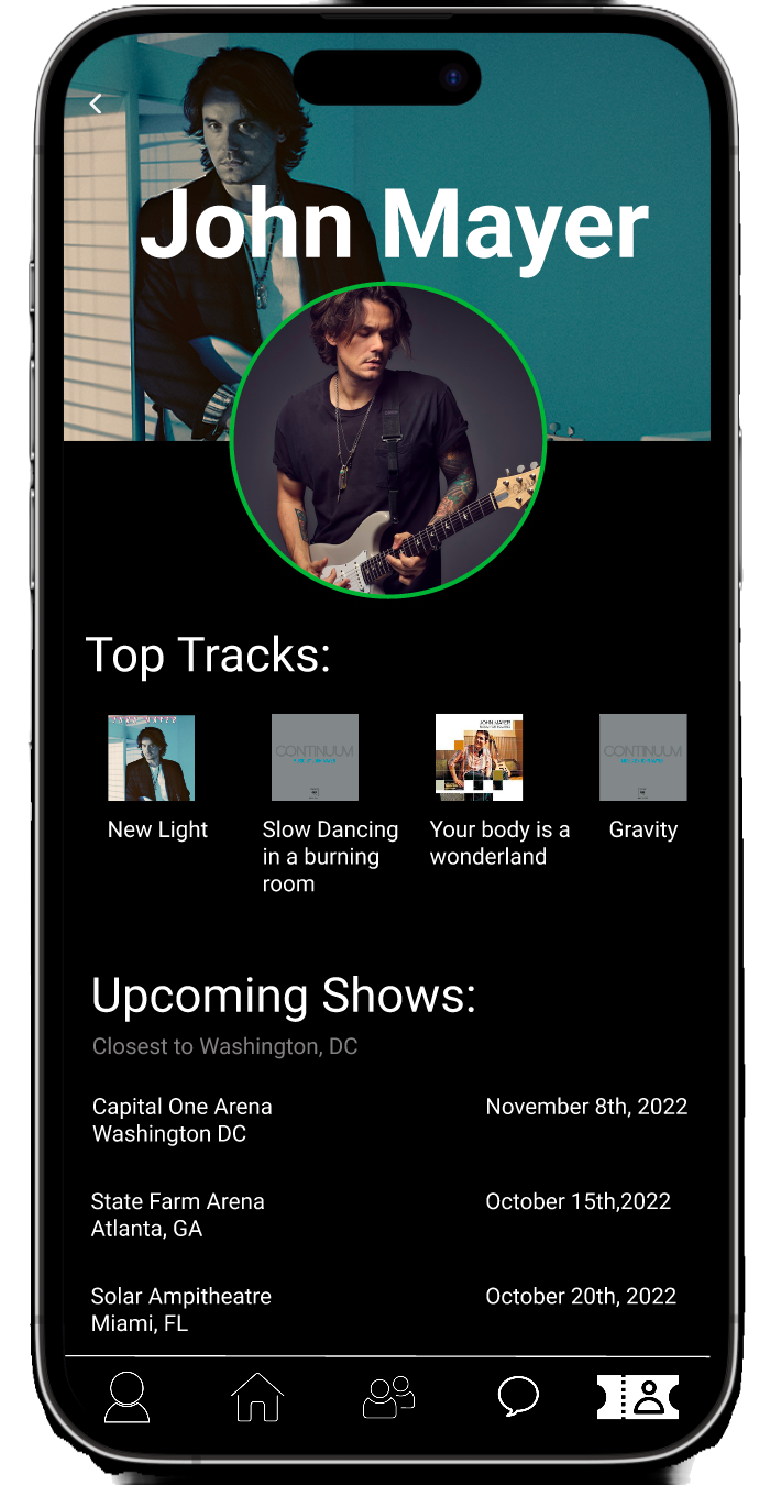
My Prototype
I have combined all the elements shown throughout the design process to create what I feel is a cool, functional, fun, and approachable app.
Other screens…

Moving Forward…
After holding multiple usability tests and making multiple iterations to the app, it is clear this app has major potential. In fact, many people are surprised this app doesn’t yet exist! There are many ways this app could expand out and link with other ticket companies and also brand out to people of all sorts. I would love to eventually launch this app (hopefully with Spotify) after seeing how much it will cost to fund the entire app.